ECommerce web design tells your potential customers about your brand and business, and it is the first thing that they see; therefore, it’s vital to update the design and make it right to leave a positive impression on your customers.
Creating a balanced website between the visual and functional effects of an e-commerce web design is not an easy task. And there is nothing that is “the best”, all you need to do is try different designs to find out what is appropriate for your brand. Luckily, we got some beautiful eCommerce design examples from different industries for you to choose from.
A. Food & Beverage eCommerce Web Design Examples
1. Bon Bon Bon
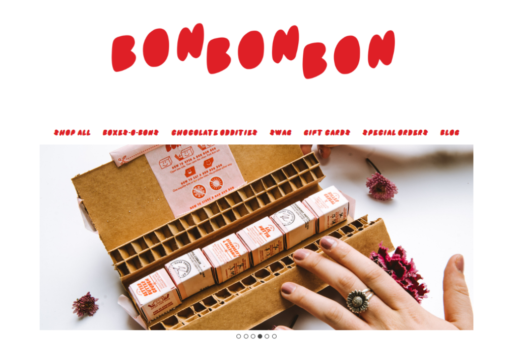
The website is bright and covered with big, high-quality images with customizations for each season/ holiday. The features and menu bar are also logically categorized and make the shopping experience easier for users.
Their home page draws your attention immediately with beautiful background images that showcase the ways that their food is hand-crafted by your order and how they handle it with care and love.
2. Rudy’s Bar-B-Q.
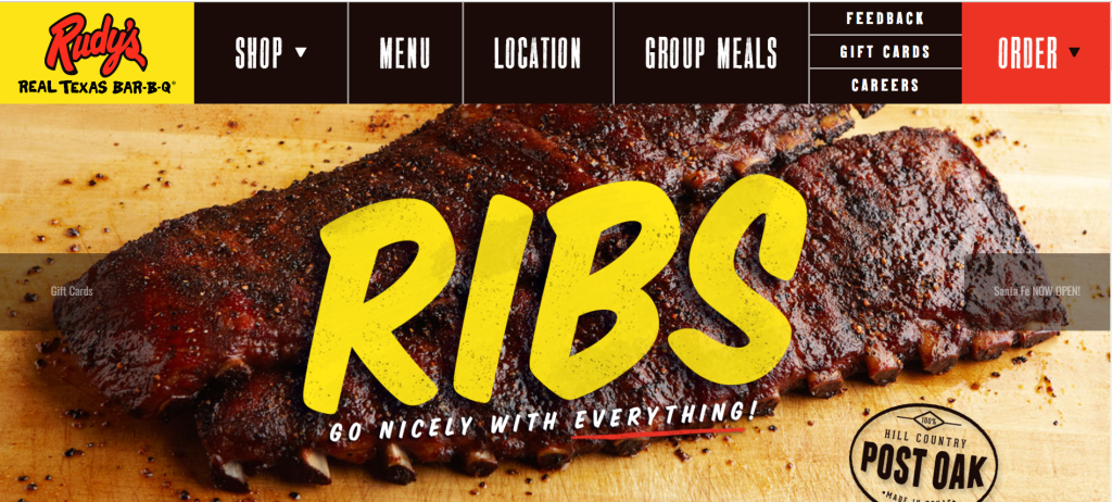
You will be impressed with the first look over its e-commerce web design: big and mouth-watering pictures, impressive text, and font; all of these are all trying to demonstrate a wild cowboy vibe that is totally connected with its signature dishes: ribs. smoked meats, sausage…, and even gift sets.
3. Pilot Coffee Roasters.
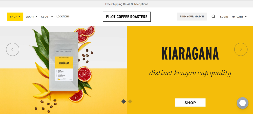
The site is minimal but welcoming, with spinning ads introducing the company’s items. Product sites include comprehensive descriptions, high-resolution photos, parameter guides, related items, and the option to compare products side by side. Also, information on the page was divided into clear different sections which is easy-to-follow: Shop (which is about products), Learn (useful tips and course for coffeerista).
4. Ben & Jerry’s
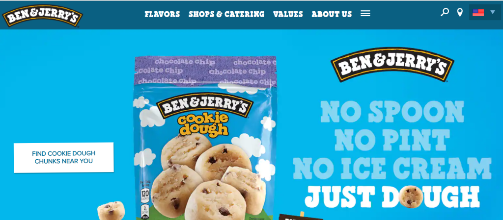
The soothing green color has brightened up the summer atmosphere, when dishes such as ice cream, cakes, and chocolate “take the throne”. The brand has successfully created an eye-catching interface with quality images, unique text and reasonable fonts.
5. Kodiak Cake
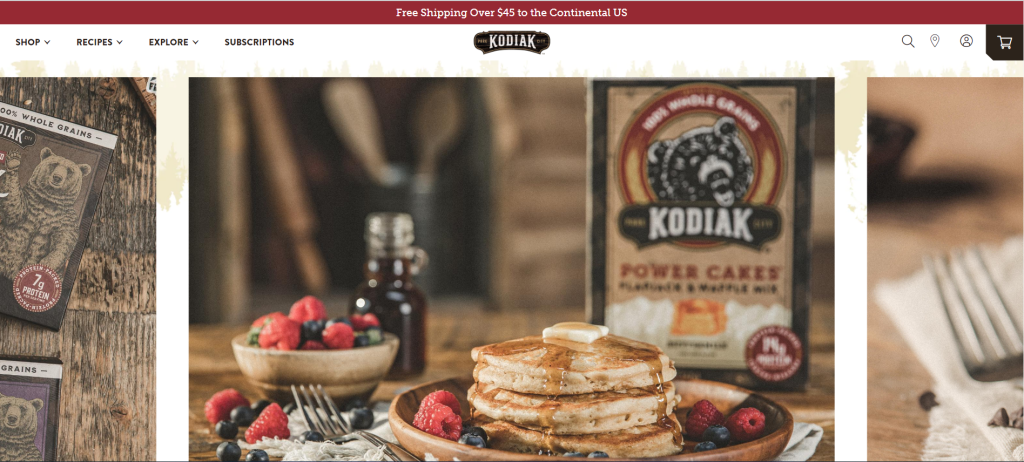
Kodiak is the brand of whole-grain baking and pancake/waffle mix. To show their “whole” feature, they built a website with natural brown tones, expressing the rustic, simple, original personality of the business.
The menu bar and the shopping are always shown up, which is easy to access for users. When you hover over the product image on each product page, it gives you the choice to buy the mix online or find it in a shop near you.
B. Fashion Ecommerce Web Design Examples
1. Thesus
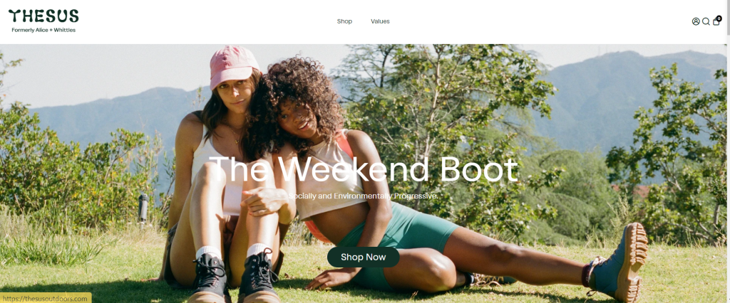
Thesus is a social and environmentally friendly brand of outdoor footwear and accessories.
What makes their website distinct, though, is that they do not fall into overcrowding the interface with photographs. Their website emphasizes the value and quality of their items through a simple design. They also show how simple it is to buy with them by emphasizing their free delivery, and returns policy. This helps to build trust among visitors who may be wary about purchasing on the internet.
2. Hebe
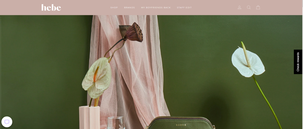
When it comes to an e-commerce business, especially a fashion business, it’s all about photography. And with Hebe, we must say it’s beautiful.
A woman’s elegance, fragility, tenderness, and nobility are clearly demonstrated in the use of photos and other elements on the website.
3. Jackie Smith
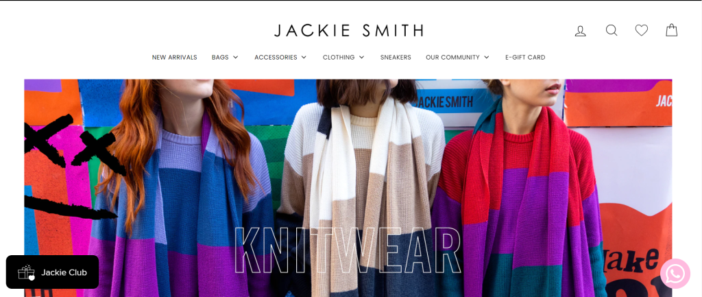
Jackie Smith is an eCommerce web design that makes good use of vibrant colors. Colors aren’t simply restricted to photographs of their brightly colored bags and advertisements.
4. Bohemian traders
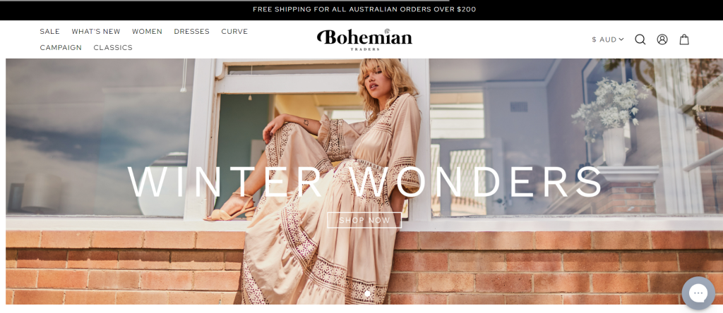
Bohemian Traders is a wonderful place to start if you’re seeking ideas on how to create a clothes eCommerce web design of bohemian style. Visitors to this eCommerce website may simply navigate between clothing products depending on the latest arrivals, occasions, accessories, or sale goods thanks to a Bohemian touch to the website design.
5. Melula
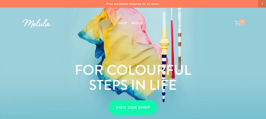
Melula is a Danish children’s fashion label that focuses on shoes. Their collections are vibrant and one-of-a-kind and they try to capture a child’s joy and inventiveness.
C. Health & Beauty eCommerce Web Design Examples
1. ILIA
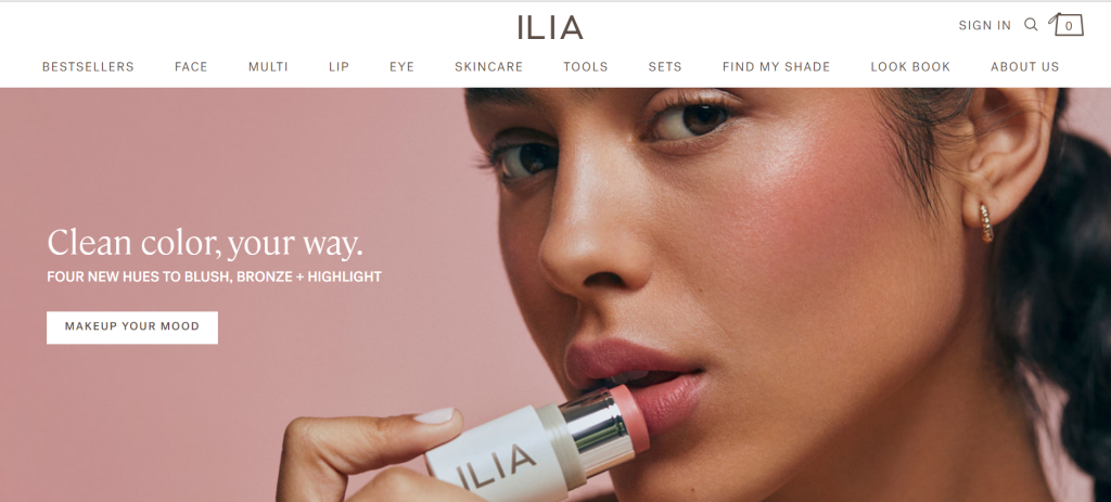
ILIA Beauty is a clean beauty brand known for products that enhance natural beauty and protect the skin.
The website design is engaging, with a soothing color palette, a simple structure, and simple navigation across all product categories. The firm takes a novel method to demonstrate their brand’s diversity: for all skin tones.
2. 100% Pure
The pages of 100% Pure are straightforward in design, and the images are equally qualified throughout all products.
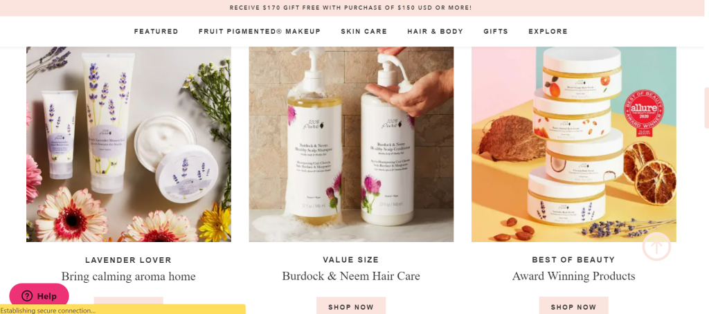
To provide credibility to a product that has been referenced by a well-known firm or received an award, 100% Pure places the certification in the corner of the product’s picture.
3. Function of beauty
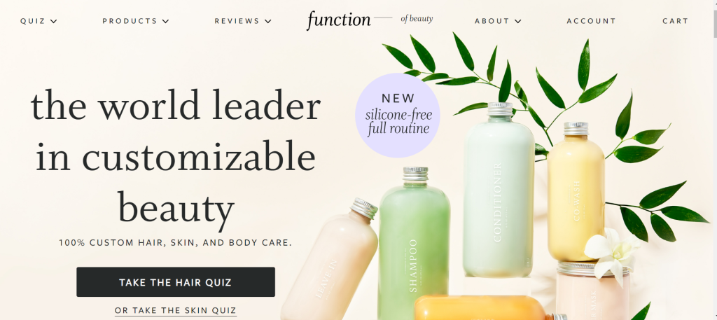
Function of Beauty provides a unique experience compared to most beauty businesses because the customers will be welcomed with a quiz. Because the success of Function of Beauty’s goods is built on matching clients with a customized shampoo and conditioner package to tackle their hair problems, it’s understandable that items aren’t displayed until users complete the questionnaire and create their “hair profile.”
4. Colorpop
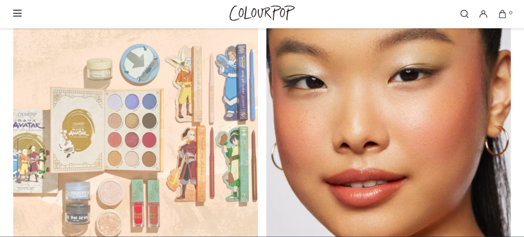
Talking about eCommerce web design, ColorPop’s product pages are well-organized and easy to navigate. Since ColorPop provides a wide range of cosmetic items, including eyes, lips, face, and makeup tools, so they categorize them and make users easier to follow.
ColorPop’s website loads quickly for product pages with a lot of dynamic pictures, and high-quality design, and we all know how important of the site speed.
C. Electronic devices Ecommerce Web Design Examples
1. Decibullz

The website design of Decibullz demonstrates how bigger pictures may be used successfully. However, in order to do so, you’ll need a speedy and dependable website. While many of the websites on our list employ a lot of bright colors, we admire their website just as much for its brilliant usage of black and white. The contrasting colors also aid in the visibility of the call-to-action buttons.
2. Skullcandy
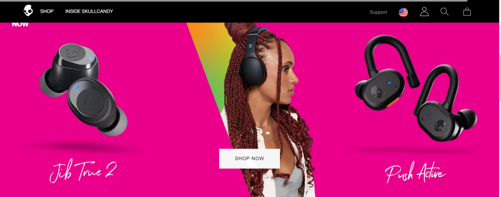
The website of Skullcandy is an excellent example of how to use color efficiently. Their website design is likewise well-balanced in terms of content and aesthetics. The use of high-quality product photographs helps visitors understand that this is a business that values quality. Overall, the website is simple to navigate and provides visitors with a seamless experience by keeping them interested throughout their trip.
If you are searching for a suitable eCommerce web design for your business, this article may help. Once you decide which one is right for you, let us – HBLAB – be your own designer to turn your idea and your story into a really successful website.
