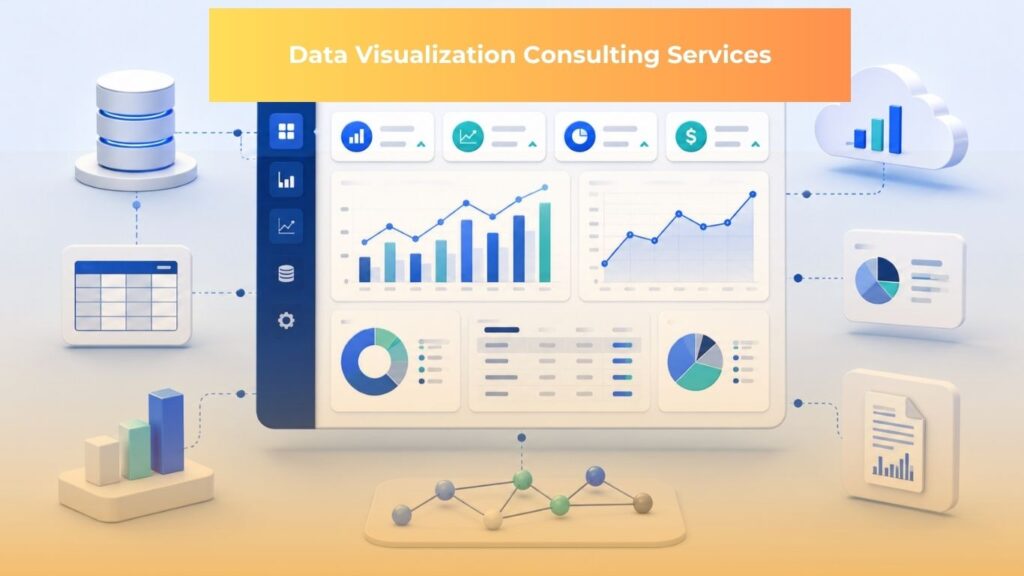
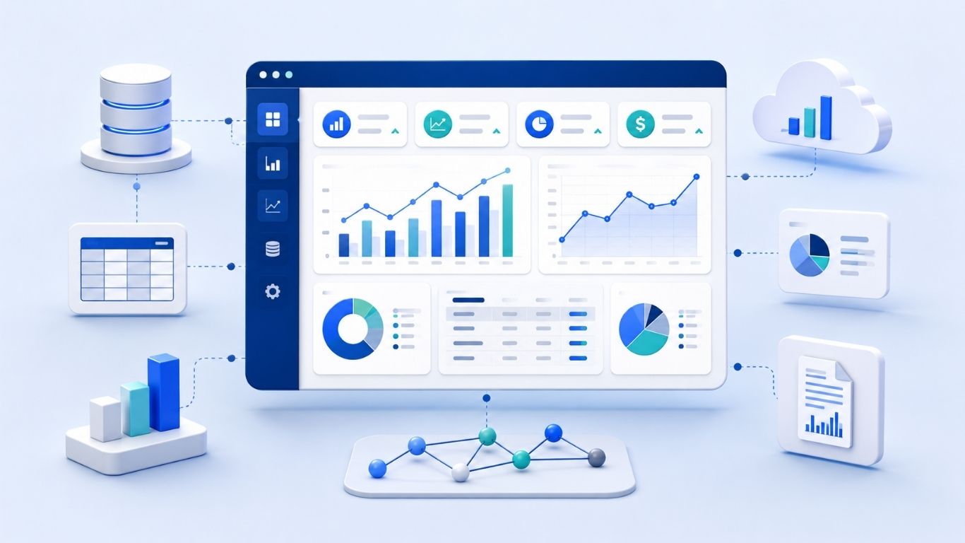
Data visualization consulting services help businesses design, build, and improve dashboards, reports, and visual analytics systems that turn scattered operational data into decision ready information.
Most companies suffer from a lack of clarity around which numbers matter, where those numbers come from, how they should be interpreted, and which decisions should follow when performance changes.
The demand for Data visualization consulting services is increasing as companies rely on larger volumes of operational, financial, customer, and supply chain data. Grand View Research estimated the global data visualization tools market at USD 9.22 billion in 2022, with a projected value of USD 22.12 billion by 2030, and Asia Pacific expected to register the highest growth rate during the forecast period.
Why Businesses Need Data Visualization Consulting Services
Many businesses already collect data from CRM systems, ERP platforms, marketing tools, finance software, operations systems, spreadsheets, databases, and cloud applications. The data exists across the organization, yet business users still spend time waiting for manual reports, comparing spreadsheet versions, or asking IT teams to confirm which number is correct.
Dashboards may already exist, although many still fail to support daily decision making. Some dashboards load slowly, some are too crowded to read, and some present metrics without explaining the business definitions behind them. When teams do not share the same understanding of revenue, conversion, churn, inventory, cost, or margin, a dashboard can create more confusion instead of reducing it.
The deeper issue is usually the absence of a reliable reporting layer. A reporting layer connects source data, business definitions, data models, dashboards, access rules, and refresh logic into a structure that users can trust. Without that layer, charts may look polished while the underlying numbers remain difficult to verify.
Data visualization consulting services help businesses convert scattered operational data into clear dashboards, reports, and visual analytics systems that support faster and more consistent decision making.
A strong dashboard should help decision makers see key performance indicators, or KPIs, which are measurable business metrics used to track progress against a goal. It should also help users understand trends, exceptions, root causes, and the next business action that needs attention. The goal is a working decision system, not a collection of disconnected visuals.
What Makes a Strong Data Visualization Consulting Partner?
A strong data visualization consulting partner should understand how business decisions are made, how data is structured, how BI tools behave, and how users actually read dashboards during work.
Business Understanding Before Dashboard Design
A useful dashboard begins with business questions. A consulting partner should clarify who will use the dashboard, which decision it supports, how often it will be reviewed, which KPIs matter most, and what action users should take when a metric changes.
For example, a sales dashboard that only shows monthly revenue, lead count, and conversion rate may look complete at first glance. A more useful sales dashboard explains how the funnel is defined, which lead stages are included in pipeline, how revenue is recognized, which customer segments are changing, and where sales performance requires management attention.
This is where consulting work becomes valuable. Internal analysts may understand the data tables, while business users understand the operating context, but a dashboard becomes useful only when both perspectives are connected. A good partner helps translate business questions into data requirements, then turns those requirements into dashboard logic that users can trust.
Data Modeling and Integration Capability
Data modeling is the process of organizing data so BI tools can calculate, filter, and display information accurately. It defines how tables, fields, relationships, measures, and business rules fit together before the dashboard is built.
Most BI projects also require ETL, which means extract, transform, load, or ELT, which means extract, load, transform. ETL collects data from source systems, cleans or reshapes it, then loads it into a target system. ELT loads data first, often into a cloud data warehouse, and transforms it afterward.
This capability matters because dashboards rarely depend on one clean source. Business data may come from Snowflake, BigQuery, Redshift, SQL databases, application programming interfaces, flat files, marketing platforms, and cloud systems. If these sources are not connected and modeled properly, the dashboard may calculate the right metric in one view and the wrong metric in another.
A strong provider should also understand common BI modeling structures such as star schema and snowflake schema. A star schema organizes data around central fact tables, such as sales transactions, and related dimension tables, such as customer, product, region, and time. A snowflake schema adds more normalized layers to those dimensions, which can be useful when data relationships become more complex.
Poor data modeling often leads to duplicated calculations, slow reports, inconsistent filters, and manual corrections. These issues may appear small during the first dashboard release, yet they become serious when more users, more data sources, and more business questions are added.
BI Tool Expertise Across Platforms
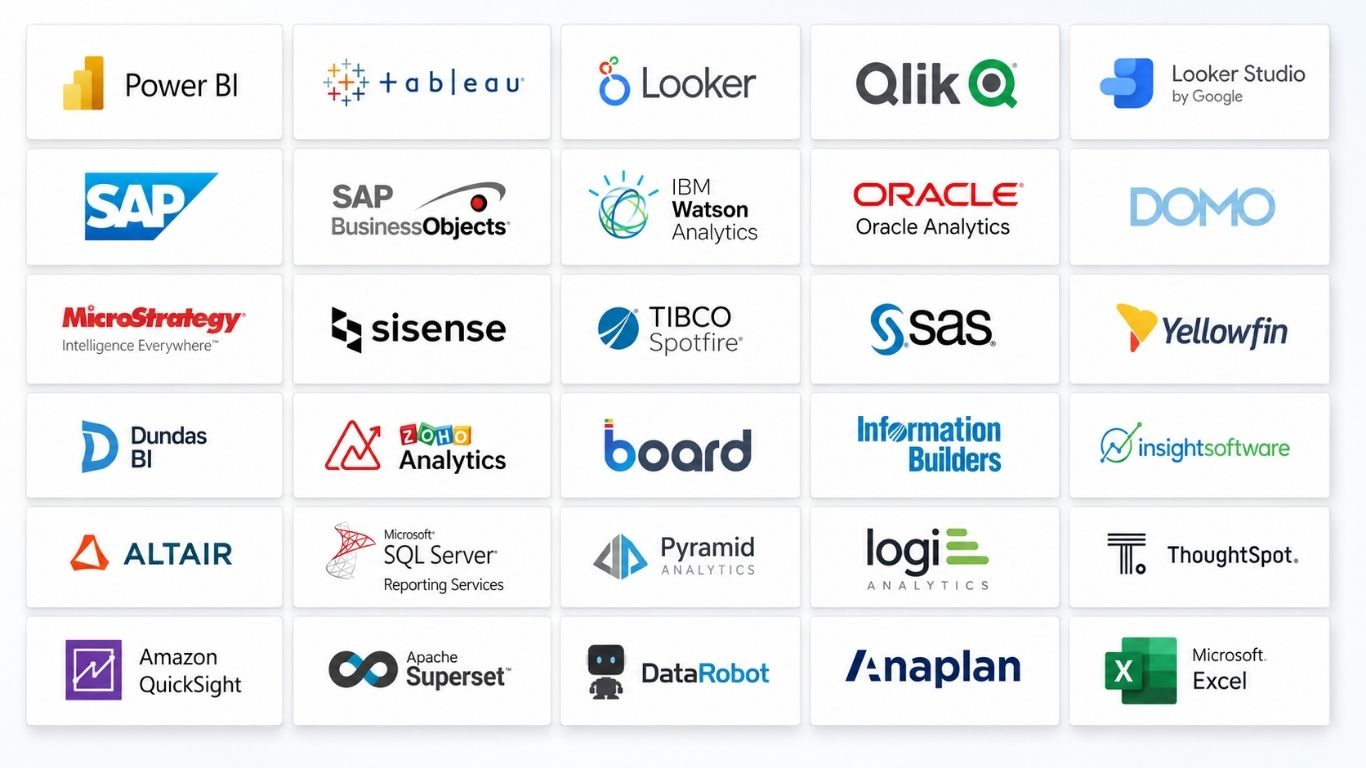
BI, or business intelligence, refers to the tools, processes, and systems that help organizations analyze data and turn it into business insight. Choosing the right BI tool requires attention to user needs, data infrastructure, governance requirements, licensing, internal skills, and maintenance capacity.
Microsoft Power BI often fits companies already using Microsoft platforms and supports complex data modeling through DAX, or Data Analysis Expressions. Tableau is strong for exploratory analytics, visual flexibility, and customized interactive data stories. Looker supports governed analytics through LookML, a semantic modeling layer that helps teams define consistent metrics in one place.
Cloud native BI tools can also be practical depending on the business case. Amazon QuickSight supports scalable dashboarding through a managed cloud model, while Looker Studio is often useful for marketing reporting and Google connected data sources. For custom analytical applications, Streamlit and Plotly Dash allow teams to build Python based data applications that can connect analytics workflows with machine learning models.
A consulting partner should not recommend a tool only because it is popular. The tool should fit the company’s data environment, user behavior, security requirements, reporting cadence, and long term operating model.
UI, UX, and Data Storytelling
UI, or user interface, refers to what users see and interact with on the dashboard. UX, or user experience, refers to how easy, clear, and useful the dashboard feels during real work.
Good dashboard design depends on information hierarchy. The most important metrics should appear first, supporting details should be available through filters or drill down paths, and each visual should answer a specific business question. A line chart may show a trend, a bar chart may compare categories, and a table may help users inspect detailed records when an exception appears.
Data storytelling in BI does not mean adding decoration or dramatic wording. It means arranging information so users can move from a high level summary to a detailed explanation without losing context. An executive may need a concise performance overview, while an operations manager may need exception tracking, root cause indicators, and the ability to filter by team, region, product, or time period.
A dashboard becomes easier to use when it guides attention. Users should be able to scan the page, understand the current situation, identify the metric that needs attention, and move into the relevant detail without asking another team to explain the report.
Performance, Governance, and Maintainability
Governance means the rules, ownership, and controls that keep data accurate, secure, and usable. In dashboard projects, governance includes access control, row level security, refresh cadence, metric definitions, dashboard ownership, documentation, and change management.
This area is often ignored during early dashboard design, although it determines whether users continue using the dashboard after launch. If two departments define the same metric differently, the report loses credibility. If access control is weak, sensitive data may be exposed. If the refresh schedule is unclear, users may make decisions based on outdated information.
Performance also needs technical planning. Consultants may need to optimize queries, reduce unnecessary visuals, simplify model relationships, adjust aggregation logic, use in memory engines such as Power BI VertiPaq or Amazon QuickSight SPICE, and configure incremental refresh for large datasets.
A mature dashboard should remain fast, understandable, documented, and trusted as usage grows. That level of reliability requires design discipline before launch and maintenance discipline after launch.
Key Benefits of Outsourcing Data Visualization Services
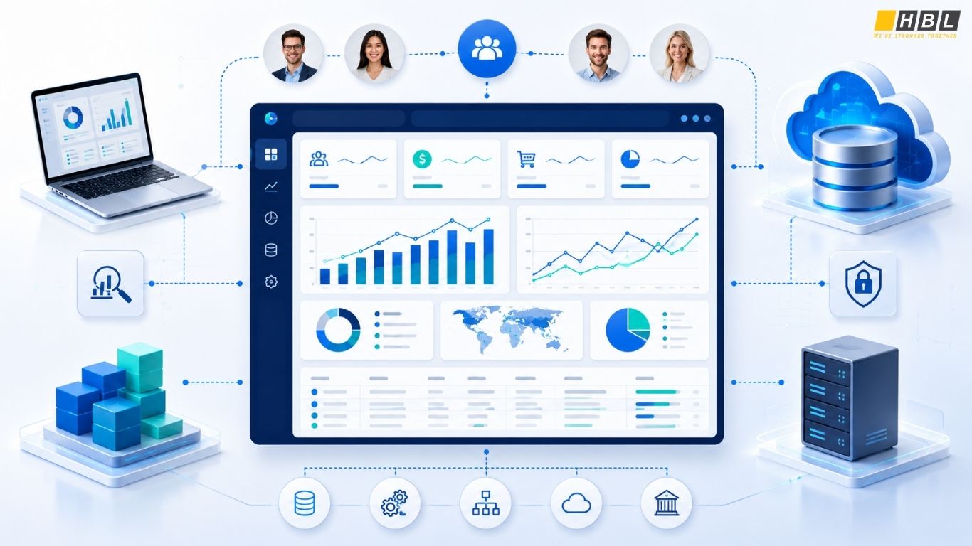
Outsourcing is most useful when a company needs BI delivery capacity, tool expertise, and implementation discipline without building a full internal team immediately. The business case is usually strongest when reporting needs are growing faster than internal data teams can support.
Key benefits include:
- Faster access to specialized BI talent: A complete BI project may require Power BI developers, Tableau specialists, Looker developers, data modelers, data engineers, dashboard designers, QA engineers, and support staff.
- Lower setup burden than building an internal BI team: Recruitment, onboarding, training, process setup, documentation, and governance take time before the first dashboard reaches users.
- Flexible scaling by project stage: Discovery, data integration, dashboard development, testing, rollout, and support require different levels of effort and different skill combinations.
- Stronger technical coverage beyond visualization: Reliable dashboards depend on clean data, stable models, access control, refresh logic, performance tuning, and documentation.
- Faster movement from reporting to decision support: The goal is to help teams make decisions with trusted information rather than produce static reports that users still need to interpret manually.
This is especially useful for companies that already have data but lack delivery bandwidth. When outsourcing is structured well, the external team handles implementation while internal stakeholders guide business priorities and approve metric logic.
HBLAB’s Data Visualization Consulting Capabilities
HBLAB positions itself as a Vietnam based data visualization consulting and BI delivery partner that helps businesses turn fragmented data into governed, high performance, decision ready dashboards.
HBLAB’s role fits companies that need dashboard delivery support, data visualization services, BI tool implementation, and technical execution across multiple data environments. The company’s strength comes from combining Vietnam based engineering scale with custom digital solution experience.
Scalable Delivery Team from Vietnam
HBLAB has 700 plus IT professionals with strong English proficiency, with 30 percent senior level employees having more than 5 years of experience. The company has 10 plus years of experience in custom digital solutions and is headquartered in Vietnam, with global presence in Australia, Singapore, Japan, and South Korea.
For BI delivery, this scale matters because dashboard projects often require more than an individual contractor. A complete project may involve business requirement clarification, data source review, model design, dashboard development, quality testing, access control setup, user feedback, and long term improvement.
Companies can work with a structured delivery team while keeping internal ownership of business priorities. This helps reduce delivery pressure without removing control from the client’s business and data owners.
Broad BI and Data Visualization Technology Stack
HBLAB Business Intelligence developers work across enterprise BI platforms, cloud native dashboarding tools, and custom data application frameworks. This allows the team to recommend a tool based on the customer’s infrastructure, users, governance requirements, and budget.
The core technology coverage includes:
Enterprise BI platforms: Power BI, Tableau, and Looker for enterprise dashboards, governed reporting, stakeholder facing analytics, and complex business logic.
Cloud native and agile BI: Amazon QuickSight and Looker Studio for scalable dashboarding, cloud data use cases, marketing data, and cost conscious reporting.
Custom data applications: Streamlit and Plotly Dash for Python based analytics apps, machine learning integration, and custom workflow requirements.
Deep Implementation Capability Beyond Dashboard Creation
- Advanced data modeling helps dashboards stay accurate and fast as data volume increases. HBLAB can support star schema and snowflake schema design, semantic model planning, and BI performance preparation for larger datasets.
- Complex calculations and business logic are often required when dashboards need cohort analysis, period over period comparisons, revenue recognition logic, sales funnel definitions, inventory movement, margin calculations, or customer segmentation. HBLAB’s team can work with tool specific languages such as DAX in Power BI, LookML in Looker, and level of detail calculations in Tableau.
- Data integration and ETL knowledge help connect BI tools to data warehouses such as Snowflake, BigQuery, and Redshift, along with SQL databases, flat files, and other source systems. When dashboard problems trace back to upstream data issues, the BI team can work with data engineers to improve pipeline logic and data readiness.
- Performance optimization helps prevent dashboards from becoming slow or difficult to use. HBLAB can review query behavior, model structure, visual load, aggregation logic, in memory engines, and incremental refresh settings to improve user experience.
- UI, UX, and data storytelling help users understand the dashboard without extra explanation. HBLAB can design cleaner dashboard interfaces that guide stakeholders from summary metrics to granular, actionable details through filters, drill downs, and structured page layouts.
Cross Industry BI Delivery Experience
HBLAB supports BI and data visualization needs across several business domains, including ecommerce, finance, healthcare, and logistics. Each domain has different data structures, KPI definitions, and decision patterns, so dashboard work should begin with business questions before visual design.
- In ecommerce, dashboards can track sales funnels, conversion, customer cohort behavior, product performance, inventory movement, and customer behavior.
- In finance, dashboards can support revenue visibility, risk monitoring, transaction analysis, profitability tracking, and compliance reporting.
- In healthcare, dashboards can support operational performance, patient flow, resource utilization, and service quality monitoring.
- In logistics, dashboards can support delivery performance, warehouse visibility, route efficiency, and service level monitoring.
Industry experience matters because a dashboard is useful only when it reflects how a business function operates. The same BI tool can produce very different outcomes depending on whether the provider understands the decision context behind each metric.
CONTACT US FOR A FREE CONSULTATION
FAQ
1. What are data visualization consulting services?
Data visualization consulting services help businesses design, build, and improve dashboards, reports, and visual analytics systems. They usually include KPI definition, data modeling, data integration, BI tool setup, dashboard design, governance, and performance optimization.
2. What is the difference between a dashboard and data visualization?
Data visualization presents data through charts, graphs, maps, and other visual formats. A dashboard combines multiple visualizations, metrics, filters, and controls into one structured view for monitoring a business process or decision area.
3. When should a business outsource data visualization services?
A business should outsource data visualization services when it needs BI expertise, faster dashboard delivery, data integration support, or specialized tool knowledge without building a full internal BI team immediately.
4. Why choose data visualization services Vietnam?
Data visualization services Vietnam can be a practical option for companies that need scalable BI delivery, data engineering support, and outsourcing flexibility. Vietnam has a large IT workforce, strong software delivery experience, and a growing base of data, analytics, and BI providers.