BI tools comparison include enterprise platforms like Microsoft Power BI and Tableau alongside lightweight options like Google Looker Studio. These platforms rely on interactive dashboards to translate raw data into visible insight.
What Are Business Intelligence Tools?
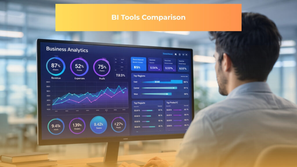
A business intelligence product is a specialized software application that retrieves, analyzes, and transforms vast quantities of data into interactive visualizations. BI tool serves as the digital translation layer between complex databases and human decision makers.
The practice of business intelligence extends beyond the software itself to represent the procedural framework of turning raw operational data into meaningful performance metrics. This discipline combines strategy, technical infrastructure, and human expertise to give organizations a comprehensive view of their historical and current operations.
Dashboards aggregate millions of individual data points into digestible charts, graphs, and heat maps that highlight operational realities at a single glance. By centralizing this information, dashboards help teams monitor market conditions, identify emerging consumer trends, and make better decisions consistently rather than relying on occasional gut intuition.

Understanding the underlying architecture clarifies how these systems function.
The four components of BI consist of:
- A central data warehouse that stores and organizes raw operational data
- Business analytics processing engines that run calculations across large datasets
- Business performance management metrics that track goals and KPIs
- An interactive user interface where teams explore and act on insights
Data must flow through these components seamlessly to provide genuine value. Successful analytics relies on the four C’s of data, which dictate that information must be clean, consistent, comprehensive, and current before it ever reaches the visualization layer. Without adhering to these standards, even the most sophisticated visualization software will output misleading insights and damage corporate strategy.
Organizations maximize their technological investments by implementing the four big data strategies of performance management, data exploration, social analytics, and decision science. These strategies depend heavily on a solid organizational foundation to succeed. The four pillars of BI are people, processes, data, and technology working in harmony to drive sustainable growth.
Mastering these concepts ensures that your investment in a new analytics platform yields tangible operational improvements rather than creating another disconnected technology silo.
Who Uses BI Tools and How They Apply Them in Practice
Modern analytics platforms serve a wide variety of professionals across the corporate spectrum. Executives rely on business intelligence software to maintain strategic oversight without getting bogged down in microscopic operational details.
A chief executive officer typically reviews a high level dashboard every morning to monitor revenue pacing, regional performance, and major operational bottlenecks. This top down visibility allows leadership to pivot corporate strategy instantly based on real time market fluctuations. Any bi tools comparison must account for the executive need for streamlined and distraction free mobile interfaces.
Finance teams represent another massive user base for these platforms. Financial analysts utilize analytics software to monitor real time cash flow, conduct complex variance analysis, and track departmental spending against allocated budgets.

Moving away from static spreadsheets allows these professionals to build automated forecasting models that update the moment a new transaction clears the enterprise resource planning system. Many users wonder if Excel is a BI tool, and while it performs basic data analysis and visualization, it lacks the automated data pipelining and large scale governance of dedicated platforms. Dedicated software eliminates the version control nightmares that traditionally plague finance departments during end of month reconciliation.
- Operations managers apply these platforms to optimize supply chains and streamline complex logistics networks. An operations director might build a dashboard that tracks inventory turnover rates across thirty different warehouses simultaneously. By visualizing supplier delivery times against consumer demand patterns, the operations team can proactively reroute shipments to prevent regional stockouts.
- Marketing and human resources departments also extract immense value from centralized data visualization. Marketing teams blend customer relationship management data with advertising platform metrics to calculate precise customer acquisition costs and campaign return on investment.
- Human resources professionals analyze employee retention rates, compensation parity, and performance review trends to improve workplace culture and reduce costly turnover.
Beginners often find Google Looker Studio is the best BI tool for starting out in these departments because of its intuitive interface and seamless connection to common data sources.
People frequently ask if SQL is a BI tool, but it is actually a programming language used to query and manage data before that data ever reaches these departmental visualization platforms.
Top BI Tools Compared
Selecting the correct platform requires matching your organizational data maturity with the specific strengths of a given software provider. A meticulous bi analytics tools comparison reveals that while most platforms share basic visualization capabilities, their underlying architectures and philosophies differ drastically.
The following top rated business intelligence tools represent the industry standard for transforming complex datasets into actionable business strategy.
Microsoft Power BI
Our primary recommendation for most organizations, Microsoft Power BI serves as the best starting point for budget conscious teams already utilizing Microsoft infrastructure. The platform approaches data analysis through deep integration with the broader Microsoft ecosystem.
Users familiar with advanced Excel formulas find a natural transition path into the platform via Power Query for data transformation and Data Analysis Expressions (DAX) for complex metric calculations. This familiarity drastically reduces the learning curve for transitioning finance and operations departments.
The distinctive features of this platform center around enterprise scale data management and artificial intelligence:
- DirectQuery connects directly to massive external databases without importing raw data into platform memory
- Dataflows create reusable data preparation logic that multiple departments can share safely
- Paginated reports provide pixel perfect formatting for highly structured operational documents
- Copilot integration enables users to generate complex visual reports by typing conversational questions
Enterprise reporting and self service analytics within Microsoft 365 environments stand out as the ideal use cases. Organizations that already rely on Teams, SharePoint, and Azure Active Directory will find that the software embeds seamlessly into their existing security and collaboration workflows.
The pricing context makes this platform incredibly disruptive. The professional tier costs approximately $14 per user per month, ensuring a strong return on investment for existing Microsoft customers seeking a powerful bi tools comparison winner without massive capital expenditure.
Tableau
Tableau stands as our top recommendation for data analysts and creative teams where visual sophistication and compelling storytelling are central to their daily work. The platform prioritizes a visual first analytics experience built specifically for deep and iterative data exploration.
Unlike platforms that require rigid upfront data modeling, the software allows analysts to drag and drop dimensions and measures onto a blank canvas to instantly see the shape of their data. This immediate visual feedback loop encourages curiosity and helps analysts uncover obscure trends hidden beneath surface level metrics.
Several distinctive features separate this software from its competitors:
- The drag and drop canvas remains the industry benchmark for intuitive visualization creation
- Tableau Pulse leverages AI to automatically deliver personalized insights based on the metrics users care about most
- A robust chart variety provides analysts with virtually unlimited creative freedom for custom visualizations
- Tableau Prep offers a highly visual interface for cleaning and wrangling messy datasets before reporting
Advanced data visualization, presentation grade executive dashboards, and exploratory analysis define the ideal use case. Media companies, creative agencies, and consumer brands frequently rely on this platform to build public facing data stories that require intense polish.

The pricing positions this software as a premium offering, starting at approximately $115 per user per month. Any bi tools comparison must acknowledge that while the cost is higher, the investment makes perfect sense for organizations that treat data presentation as a core competitive advantage.
>> Power BI vs Tableau: the Winning Formula for Data Brilliance
Qlik Sense
Qlik Sense is highly recommended for advanced users and data teams who need maximum flexibility to explore complex relationships across massive and unstructured datasets. The platform approaches business intelligence through a proprietary associative data engine that lets users explore information in any direction without relying on predefined query paths.
Traditional platforms require analysts to drill down through a strict hierarchy. Qlik connects every data point to every other data point across the entire application automatically, a fundamental architectural difference.
The distinctive features of the platform revolve around this unique processing capability:
- The associative model highlights data excluded by a user selection, often revealing critical blind spots in operational processes
- In memory data processing ensures lightning fast calculations even across dashboards containing hundreds of millions of rows
- Insight Advisor uses AI to suggest optimal chart types and generate analytical insights automatically
- Smart search lets users type keywords and instantly locate matching values across disparate database tables
Complex and multi source data exploration serves as the primary use case. Industries with non linear analytical needs, such as healthcare networks managing patient records or global supply chain logistics firms, benefit immensely from the associative engine.
A bi tools comparison reveals that this platform thrives in environments where business users frequently need to ask unanticipated questions that the original dashboard designer did not specifically plan for.
Looker (Google Cloud)
Looker is strongly recommended for enterprise data engineering teams that need governed and consistent data definitions across departments standardizing on Google Cloud infrastructure. The platform champions a semantic layer first approach to business intelligence.
Instead of allowing every analyst to define their own metrics locally, the software requires data engineers to define all business logic centrally using a proprietary modeling language. This philosophy ensures that when the marketing team and the finance team pull a report on total monthly revenue, the numbers match perfectly every single time.
The most distinctive features of this platform cater to strict data governance:
- LookML serves as the centralized nervous system for all metric definitions and integrates with version control systems like Git
- Embedded analytics allow developers to white label dashboards and inject them directly into commercial applications
- Tight BigQuery integration pushes complex calculations down to the database level rather than processing in the browser
Large organizations that need governed data definitions across dozens of regional offices represent the ideal use case. The platform excels in environments where strict regulatory compliance and absolute data accuracy outweigh the need for rapid visual exploration.
Including this platform in a bi tools comparison highlights the fundamental choice between giving business users total freedom versus maintaining strict centralized control over the corporate data model.
Google Looker Studio
Google Looker Studio is the definitive recommendation for freelancers, marketing agencies, and small teams needing fast, shareable, and zero cost dashboards connected to the Google ecosystem. The software embraces a lightweight browser based approach to reporting that removes all technical barriers to entry.
Users can log in with a standard email account, connect a data source, and publish a live dashboard to the web in a matter of minutes without writing a single line of code.
The distinctive features prioritize accessibility and speed above all else:
- The platform is entirely free to use, eliminating the procurement friction associated with enterprise software deployments
- Native connectors for Google Analytics, Google Ads, and Search Console allow digital marketers to pull live campaign data instantly
- Google Drive sharing permissions make it simple to restrict access or collaborate with external clients securely
Marketing campaign dashboards, search engine optimization reporting, and small business analytics stand out as the perfect use cases. Agencies frequently use the platform to automate their monthly client reporting, saving hundreds of hours of manual data entry.
When conducting a bi tools comparison focused purely on immediate utility and low overhead, this platform provides an unmatched solution for teams that require functional visibility without the complexity of a centralized data warehouse.
FAQs
1. What are the top 5 BI tools?
Based on 2026 market analyses, the top 5 business intelligence tools are:
- Microsoft Power BI – Best overall for integration and cost.
- Tableau – Excels in advanced visualization.
- Qlik Sense – Strong for associative data exploration.
- Looker – Ideal for governed data models.
- ThoughtSpot – Leading in AI-powered search analytics.
2. Which Power BI tool is best?
Power BI Premium is the best version for advanced features like AI visuals, large datasets, and paginated reports, starting at $20/user/month. For basic needs, Power BI Pro ($14/user/month) suffices, while Desktop is free for individual use.
3. What are the top 5 data visualization tools?
The top 5 data visualization tools in 2026 are:
- Tableau – Best for interactive dashboards.
- Microsoft Power BI – Strong for Microsoft integration.
- Looker Studio – Free and Google-friendly.
- QlikView – User-friendly for self-service.
- D3.js – Flexible for custom web-based viz.
4. What are the top 10 analytics tools?
Top 10 data analytics tools for 2026 include:
- Python – Versatile scripting.
- SQL – Essential querying.
- Microsoft Power BI – BI reporting.
- Tableau – Visualization.
- Excel – Basic analysis.
- R – Statistical computing.
- SAS – Enterprise analytics.
- Apache Spark – Big data processing.
- Google Analytics – Web tracking.
- Databricks – AI and ML.
5. What’s better than Power BI?
No single tool is universally better, but strong alternatives include Tableau (superior visualization), ThoughtSpot (AI-driven search), and Looker (governed metrics). Choose based on needs like cost, ecosystem, or AI focus.
6. What’s better, Power BI or Tableau?
It depends: Power BI is better for cost ($14/user/month), Microsoft integration, and scalability; Tableau excels in visual depth and storytelling ($115/user/month). Power BI suits budget-conscious teams; Tableau fits creative analysts.
Read more:
– Legacy Systems: What They Are, Why They Persist, and What to Do About Them
– PowerBI Service: Unlocking Scalable Business Analytics
– Technology Strategy for Non-Technical Executives: What It Is and How It Works