When creating an online store, the homepage design receives a lot of attention — after all, it’s the first element customers see when they visit. But the real purpose of any e-commerce website is sales, and you won’t get there until you have great product pages. Marketers can select from a wide range of features and variations when creating a product page. This post will show you some of our favorite e-commerce product pages to set examples and explain what makes them so wonderful. We hope you can include some of their characteristics in your next product page design!
What is a Product Page?
A product page is a page on a website that assists clients in deciding what to purchase. It comprises many specifications and characteristics to help answer queries, provide reviews, allow product comparison, and facilitate the buying process.
To create an ideal product page, you’ll have to go through the following steps:
- Create a descriptive product name.
- Add recognizable photographs with an enlarged view option.
- Include a price list.
- Provide apparent product alternatives, such as color or quantity, as well as a simple manner to select them.
- Display product availability.
- Make it simple to add products to the cart and provide clear feedback when they are.
- Provide brief and informative descriptions.
- Make use of social proof.
5 Examples of E-commerce Product Pages for your reference
Master & Dynamic

When you visit a Master & Dynamic product landing page, phrases like “bold,” “elegant,” and “luxury” spring to mind. Close-up photos of the brand’s headphones showing the features demonstrate the item’s quality and attention. It begs the question of what they sound like.
This product page is now distinct from the norm. At first sight, there is no Add to Cart button or specific product information, simply a recognizable product image and descriptive product name. To go to the main shopping cart, you must scroll down.
The product pages of Master & Dynamic are almost like experiences in and of themselves. As you continue, you’ll learn more about the headphones’ detailed design—what they’re composed of, their innovative features, and how to use them.
However, Master & Dynamic does not entirely disregard design in favor of conversion rate. The floating Add to Bag bar at the top of the page is subtle enough not to detract from the experience while also serving as a continual reminder that you can personalize these headphones. If you want to buy them, you don’t have to scroll all the way back up and disrupt the experience. (There’s also a great reminder of all the other color options!)
Kettle & Fire
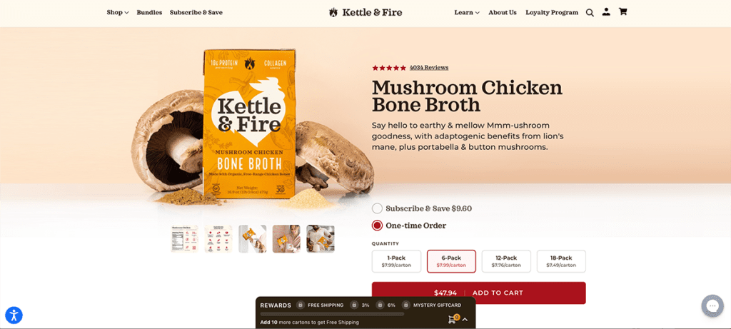
 Kettle & Fire sells world-renowned chefs’ bone broths and soups in containers that may be stored in your cupboard for up to two years.
At first sight, the product detail page looks similar to an Amazon listing page, with a carousel of different product photographs, such as lifestyle shots, nutrition labels, “what’s inside” infographics, and more. Under the product name, customer ratings are highlighted, and bulleted lists are used to present facts in a concise and useful manner.
While Kettle & Fire has a few different purchasing choices, it gives buyers a simple way to select and add things to their cart. It also emphasizes its refund and delivery conditions beneath the Add to Cart button.
Rocky Mountain Soap
Rocky Mountain Soap, a natural body care retailer, understands that its ideal customers prefer high-quality and natural goods. Its product pages contain brief and comprehensive descriptions highlighting major benefits: GMO-free, tested only on people, and 100% natural. These are all valid reasons for a buyer to acquire Rocky Mountain’s body care goods, and they can assist boost sales and decreasing abandoned purchases.
The attached user reviews are another unique feature of Rocky Mountain Soap’s product pages. You may easily navigate through recent testimonials if you’re on the fence about purchasing one of its goods.
Rocky Mountain Soap obviously understands the value of client feedback. A quarter of those polled by Bizrate Insights said they always read customer reviews when shopping online, and 40% said they did so frequently. The social proof directly underneath the product, indicating that it has received five stars from several delighted customers, is a guaranteed method to alleviate a buyer’s anxiety over never having touched the thing in person.
Perfect Keto
Perfect Keto checks off a lot of boxes when it comes to product page optimization. It assists in providing shoppers with the information they require as quickly as possible by:
- Using a product title and write-up that is descriptive
- Displaying customer feedback
- Displaying product selections, highlighting what’s fresh and what’s limited
- Multiple payment options are available, including interest-free installments and “subscription and save” options for recurring orders.
- Using bullet points to communicate benefits
- Making use of high-quality product photographs
If you’re still not convinced, keep scrolling for more information, including recipes, ingredients, reviews, lifestyle images, and more.
Johnny Cupcakes
Johnny Cupcakes is a fun brand that promotes itself as “the world’s first t-shirt bakery” and describes all of its new products as “freshly baked.” It’s a fun concept that goes well with it.
It uses product photography well, displaying high-quality photographs of its apparel and interesting designs. And who can resist the loading animation of a chubby kid chasing an elusive cupcake?
When you click the Buy Now button, a shopping cart appears on the right side of your screen, reminding you that you can check out at any time. It’s a not-so-subtle message that you haven’t closed the sale yet and clearly defines the payment options. This effectively converts the landing page into the checkout page, which is an excellent approach to simplify the purchasing process.


